How clean is Canada’s water? What the data shows
Grades 9 - 12
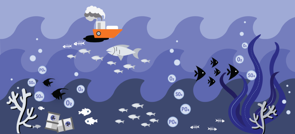
Water quality can have a tremendous impact on every life form — from microorganisms, to wildlife, livestock, and humans — as well as on terrestrial ecosystems, climate, and nature.
Statistics Canada collects water quality data from different aquatic ecosystems across the country. It monitors the various physical-chemical characteristics of our water, including pH, temperature, metal content, chemical species, alkalinity, and nutrients. Changes in each of these parameters can significantly affect ecosystems and societies.
How can we use observational data from Statistics Canada to investigate the water quality in Canada? Are there any interesting trends in the above-mentioned quality parameters?
To answer our question we:
- Used national long-term water quality monitoring data from Statistics Canada
- Created a series of line graphs and scatter plots
Visualizing the data
We investigated five parameters in the dataset – pH, dissolved oxygen, water temperature, dissolved sulphate, and dissolved phosphorus.
pH is a measure of the concentration of hydrogen ions in a solution. It indicates how acidic or basic the solution is — the higher the concentration of hydrogen ions, the more acidic the solution is. Even a slight change in the pH levels of water can have a drastic impact on the survival of aquatic life.
Dissolved oxygen is used by aquatic life for respiration. Low levels of dissolved oxygen can lead to increased mortality of fish eggs and negatively impact other aspects of aquatic ecosystems.
Changes in water temperature have wide-ranging impacts, including on the migration and breeding patterns of different species, the amount of dissolved oxygen, nutrient circulation, fish population, and so on.
Sulphate — an oxidized form of the element sulphur — is essential for many biological processes, and phosphorus is essential for the growth of plants and animals. Changes in sulphate and phosphate concentrations can seriously threaten ecological balance.
To investigate provincial trends in these water quality parameters, we created a series of line graphs. To take a closer look at a specific parameter, click the drop-down arrow at the top of the graph.
In the plot above, pH and concentrations of dissolved oxygen, sulphate, and phosphate appear to have remained consistent in all provinces, with minor yearly fluctuations. However, Manitoba showed an overall higher concentration of dissolved phosphorus. Nova Scotia’s water is low in pH, making it relatively acidic. In Alberta, British, Columbia, Manitoba, Yukon, and Prince Edward Island, the water is more basic, with high pH values.
Next, we created scatter plots to investigate dissolved oxygen in different provinces. The size of the bubbles represents the concentration of oxygen in the water; the larger the size, the higher the concentration.
In this interactive plot, you can toggle the province and territory names to turn on/off their respective data graphs. To take a closer look at a specific year, drag the button on the sliding bar at the bottom of the graph. To see an animation over the years, click the play button at the bottom of the graph.
The scatter plot allows us to look at specific locations by latitude and longitude. You can observe the same trends as the line graph, with no significant changes in the overall concentration of dissolved oxygen. You can also see that more observations are made in BC than in any other province.
While creating the above visualizations, we came across some strange values, where measurements deviated from the general patterns. Tackling outliers like these in data is a common and important element of data science. Take a look at the Jupyter Notebook to learn how we tackled the outliers in these datasets.
What do you notice in this data visualization? What makes the water in Nova Scotia more acidic? What is the best type of graph to show the quality of Canadian water? Which additional parameters would you investigate to discover more about the water quality?
Reflect on what you see
Look and interact with the data visualizations above. When you hover your mouse over the plots, you’ll notice more information appears. You can also use the legend to make plots appear and disappear.
Think about the following questions.
- What do you notice about these graphs?
- What do you wonder about the data?
Use the fill-in-the-blank prompts to summarize your thoughts.
- “I used to think _______”
- “Now I think _______”
- “I wish I knew more about _______”
- “These data visualizations remind me of _______”
- "I really like _______”
Learn how we visualized the data
Go to our walk-through (in Jupyter notebook format) to see how the data science process was applied to create these graphs, from formulating a question, to gathering the data, and analyzing the data with code.